Your senior care community provides a great service to your residents and their families, but is your website showcasing the quality of care you provide?
With so many choices, choosing the right community can become overwhelming for future residents and their families. Set your organization apart from competitors with a user-friendly, highly accessible, website that builds trust.
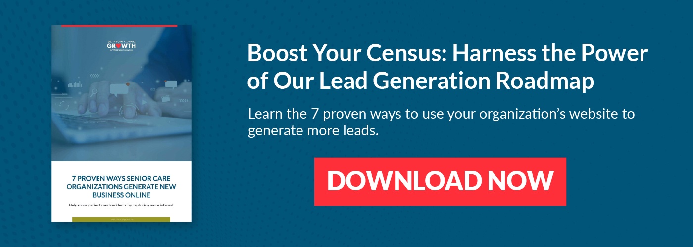
How do your marketing and sales activities stack up to other communities? Download the Senior Care Sales and Marketing Report to find out!
Follow these 10 best practices to ensure your senior living website makes a great first impression with prospective residents.
Top 10 Senior Living Website Best Practices
- Make it easy for visitors to accomplish their main goal
It’s so important to realize that not every website visitor is ready to make a decision. Many aren’t even ready to schedule a tour yet. If a website visitor is just starting the research process, what information might they be looking for? Does your website offer that content? What if they’re actually ready to speak to someone? How easy is it for them to speak to someone at the community? - Give very obvious next steps
Don’t leave visitors guessing what to do next. Offer visitors clear CTAs (Call to action) that entice them to take a next step. Make the color of these buttons contrast with the rest of the site so they stand out. It’s not super scientific, but I like to use the “squint test.” Look at your website, now squint. What stands out? Ideally your headline (which should include a statement that clearly communicates what makes your community different) and your CTAs should pop off the page. If they don’t, you’re probably not drawing you audience’s attention to the right elements. - Build effective landing pages
Landing pages are the pages on your site where you offer something to the visitor in exchange for their information. Your “offer” could be a helpful guide to choosing the right community, or it could be an offer to schedule a tour. Whatever the case may be, make sure your landing pages have very clear, benefit-focused messaging. Remove navigation from these pages so that visitors focus on the task at hand – completing the form. - Offer intuitive navigation
Don’t overcomplicate your site’s structure, or sitemap. Your website visitors’ comfort with using navigational elements can vary so we recommend keeping it simple. If you’re struggling with where certain content should live on the site, we like to use a card-sort exercise. List on post-it notes the various information you want to include on the site and then group those items in logical clusters. Sometimes the simple act of making the information tangible can help give clarity. - Keep forms simple
Forms on your website should be limited to the information that is absolutely critical for where that visitor is on the buyer’s journey. When you keep forms simple you minimize confusion and also increase the chance of someone completing that form. Think of each form field as a barrier. Limit the barriers to interaction with your site, and therefore sales team, by minimizing form length. - Ensure web accessibility and color compliance
Test your color palette to ensure that everyone, including people with visual impairments, can read and process your website - Make text legible
We know that many senior living website visitors are often adult children doing research for their parents. But, older demographics are increasingly technology savvy and are doing their own research. Make it easy for them to use your website by sizing text appropriately. - Design the site for all devices
A recent report shows that over 40% of all web traffic now happens on mobile devices. It’s for this reason that many designers now take a “mobile-first” design philosophy. Rather than treating the mobile version of the site as an afterthought, they prioritize the mobile version. - Clearly differentiate your community
Many community websites get lost in a “sea of sameness.” Take an objective look at your community’s site vs. your competitors’ sites. Is it painfully obvious how your organization differs from the others? Give visitors reasons why someone should choose your community over another one with crystal clear positioning statements that showcase exactly WHO you help, and HOW you help. - Show interactions, not just amenities
Why do most residents choose your community? Is it because of the floorplan? The dining hall? I bet in most cases you’ll find that the real reason is the people. So many senior living websites only focus on the building, the amenities. Spend more time focusing on your residents and your staff, and the interactions between the two that mean so much.